Action container
Examples
Default Button Set
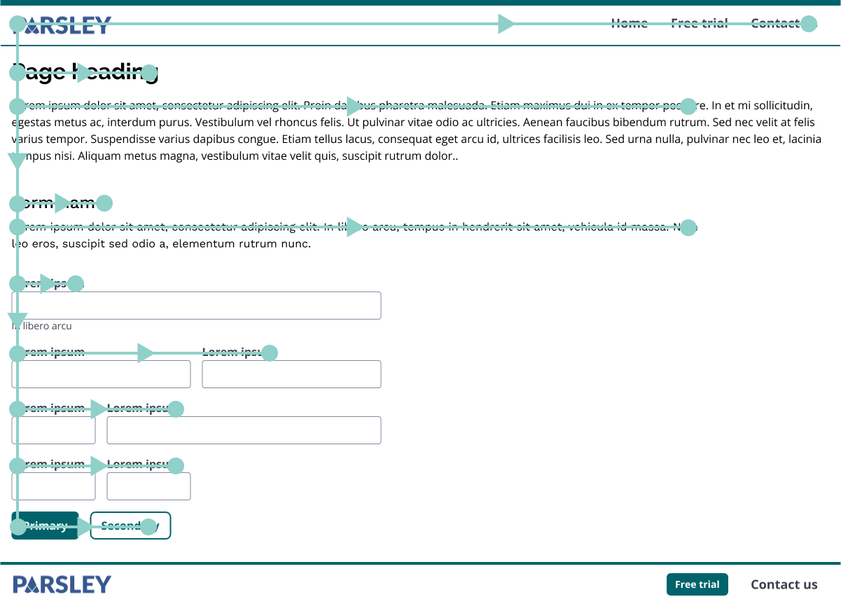
Used for the F-pattern style reading, the default button set has one primary button and one or two secondary and/or tertiary buttons. See the Button pattern for details of when to use the secondary and tertiary styles.
One Button
For one button the primary button variation should be used.
Code
1<ActionContainer>2 <Button variation="primary" onClick={() => {}}>Submit</Button>3</ActionContainer>
Two Buttons
For two buttons a primary and a secondary button is the recommended usage, the secondary button is output first. The primary action should always be output last, this allows users to see/hear the non committal action first and it also positions the primary action closest to the users thumb in mobile devices.
Code
1<ActionContainer>2 <Button variation="secondary" onClick={() => {}}>Cancel</Button>3 <Button variation="primary" onClick={() => {}}>Submit</Button>4</ActionContainer>
Two Buttons - Equal actions
For content where two actions of equal weighting are required then the recommended usage is for these buttons to both be styled as secondary actions
Code
1<ActionContainer>2 <Button variation="secondary" onClick={() => {}}>Cancel</Button>3 <Button variation="secondary" onClick={() => {}}>Submit</Button>4</ActionContainer>
Three Buttons
For three buttons a primary, a secondary and a tertiary button are the recommended usage, the order should proceed from least important to most important.
Code
1<ActionContainer>2 <Button variation="tertiary" onClick={() => {}}>Cancel</Button>3 <Button variation="secondary" onClick={() => {}}>Save</Button>4 <Button variation="primary" onClick={() => {}}>Submit</Button>5</ActionContainer>
Modal Button Set Examples
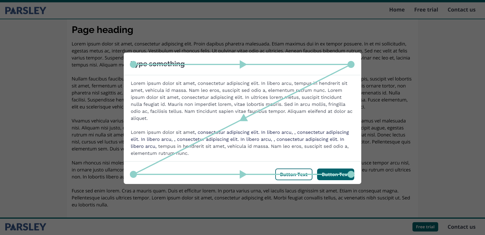
Used for the Z-pattern style reading, the default modal button set has one primary button and one or two secondary and/or tertiary buttons. See the Button pattern for details of when to use the secondary and tertiary styles.
One Button
For one button the primary button variation should be used.
Code
1<ModalFooter>2 <ModalClose>3 <Button variation="primary">Done</Button>4 </ModalClose>5</ModalFooter>
Two Buttons
For two buttons a primary and a secondary button is the recommended usage, the secondary button is output first. The primary action should always be output last, this allows users to see/hear the non committal action first and it also positions the primary action closest to the users thumb in mobile devices.
Code
1<ModalFooter>2 <ModalClose>3 <Button variation="secondary">Cancel</Button>4 </ModalClose>5 <Button variation="primary" onClick={() => {}}>Submit</Button>6</ModalFooter>
Two Buttons - Equal actions
For content where two actions of equal weighting are required then the recommended usage is for these buttons to both be styled as secondary actions
Code
1<ModalFooter>2 <ModalClose>3 <Button variation="secondary">Cancel</Button>4 </ModalClose>5 <Button variation="primary" onClick={() => {}}>Submit</Button>6</ModalFooter>
Three Buttons
For three buttons a primary, a secondary and a tertiary button are the recommended usage, the order should proceed from least important to most important.
Code
1<ModalFooter>2 <ModalClose>3 <Button variation="tertiary">Cancel</Button>4 </ModalClose>5 <Button variation="secondary" onClick={() => {}}>Save</Button>6 <Button variation="primary" onClick={() => {}}>Submit</Button>7</ModalFooter>
Wizard button set
Used for a specific version of the Z-pattern style of reading, where the customer is likely to want to move to and fro through a wizard. The default wizard button set has one primary button on the right and one or two secondary and/or tertiary buttons on the left. See the Button pattern for details of when to use the secondary and tertiary styles.
One Button
For one button the primary button variation should be used.
Code
1<ActionContainer patternType="z">2 <Button variation="primary" onClick={() => {}}>Submit</Button>3</ActionContainer>
Two Buttons
For two buttons a primary and a secondary button is the recommended usage, the secondary button is output first. The primary action should always be output last, this allows users to see/hear the non committal action first and it also positions the primary action closest to the users thumb in mobile devices.
Code
1<ActionContainer patternType="z">2 <Button variation="secondary" onClick={() => {}}>Cancel</Button>3 <Button variation="primary" onClick={() => {}}>Submit</Button>4</ActionContainer>
Two Buttons - Equal actions
For content where two actions of equal weighting are required then the recommended usage is for these buttons to both be styled as secondary actions
Code
1<ActionContainer patternType="z">2 <Button variation="secondary" onClick={() => {}}>Cancel</Button>3 <Button variation="secondary" onClick={() => {}}>Submit</Button>4</ActionContainer>
Three Buttons
For three buttons a primary, a secondary and a tertiary button are the recommended usage, the order should proceed from least important to most important.
Code
1<ActionContainer patternType="z">2 <Button variation="tertiary" onClick={() => {}}>Cancel</Button>3 <Button variation="secondary" onClick={() => {}}>Save</Button>4 <Button variation="primary" onClick={() => {}}>Submit</Button>5</ActionContainer>

